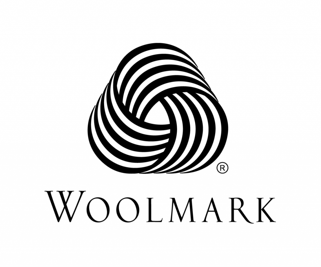
The Woolmark logo is great logo to look at for many reasons.
Firstly, the image looks 3D almost as if it is coming out of the screen. I also
believe the logo would work well everywhere as it is imaginative, eye catching
and elegant. I also like how simple, quirky and unique it looks making the
image look equal. I believe that the influence of the Woolmark logo came from
the Bridget Riley and her Op art. Bridget Riley began using black and white
paint as this was what she was known for. She used geometric forms to produce
movement within the colours, an optical illusion. I believe that this was a huge influence on
the designer Francesco Saroglia with its use of simplicity. The logo was
designed in 1960’s and launched at the same time, I believe a huge influence
was pop art and op art. Pop art consisted of wide, bold lines and made the
image stand out.
Woolmark is a hundred percent pure wool and this logo
implies that the item is made with pure wool. I personally believe the logo is
very well thought out because it is one of the most recognisable symbols and
indicates a product being one hundred per cent Pure New Wool.

No comments:
Post a Comment