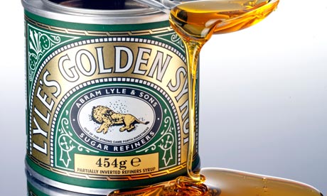
After finding out from Liam in college that Lyles Golden Syrup is a brand that has
made few changes over its long history I have decided to write more in depth into it to find the reason why it hasnt been changed. This
brand has a very personal look towards it with its history; the lion and bees
logo has maintained the same since 1885. This logo was a religious view from
Abram Lyle “Out of the strong came forth sweetness”. This has remained unchanged
and has become a recognized and iconic figure. The packaging has stayed the
same with its use of precise, fluid swirls and this could be seen as an
advantage as its eye catching and unique. It is also very iconic and quirky
which makes the design innovative and exaggerated.
The product soon became very popular
within England was even sold to the royal family in England. This soon led to
Lyle’s Golden Syrup containing a “Royal Warrant” on its tin. This was a symbol
to show that Lyle’s was an official supplier to the Royal Family. In 2007 Lyle’s
was then given a Guinness World Record as the world’s oldest brand. Lyle’s is
also seen as an iconic figure in British kitchens. In 2008 Lyle’s Golden Syrup
celebrated 125 years in business. Lyle’s Golden Syrup is now selling over a
million tins every month and are sent from the UK to places abroad such as
Chine, South Africa, Australia, USA and even Yemen.
In conclusion, I believe that the business
has worked because they haven’t changed their identity in over a hundred years
and has stayed an iconic figure for Britain and their kitchens. Lyle’s Golden
Syrup has made few changes to the packaging and I believe that this was the
best decision because it remains unique and I like how personal the brand is.
It is a very distinctive brand and is easily recognizable and iconic in the UK
and other countries. It is now known as the world’s
oldest and best loved brand.

No comments:
Post a Comment