Wednesday 22 April 2015

Module Evaluation OUGD402

For my end of module evaluation I think a lot of things went well this brief. I have learnt a lot about myself and who I am as a designer. I am slowly starting to progress as a graphic designer and I am starting to create a personal identity for myself.  I have enjoyed working throughout the whole year on our briefs especially studio brief 02 as it gave me an identity and made me realise who I am. I have enjoyed creating business cards and learning about business cards and how they are suppose to replicate you. I have learnt the importance of a business card and how it is suppose to look for it to be professional looking. I was very satisfied with my final outcome and hope to further my business card(s) so I could potentially give clients my details. 

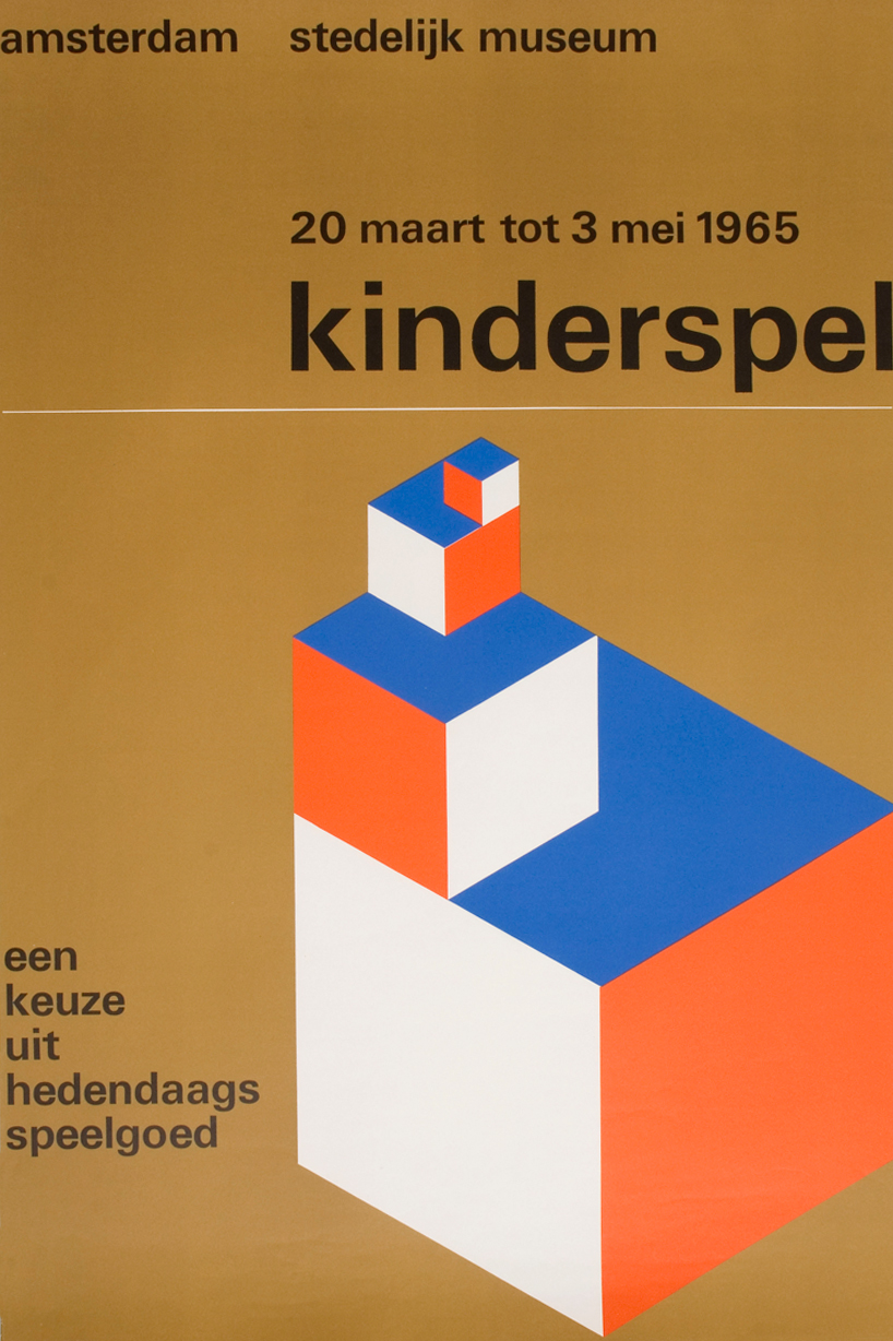
If I could go back and improve on my year I wish I looked more in depth into artists and how they have become famous for their work. I also wish I had blogged a bit more in general as I feel I could have achieved a lot more and could have benefited from learning about other designers. I wish I looked into artists who are more like myself which use a simplistic but neat approach. In general, I have learnt a lot about designers, studios, logos and many more. 

There are a few things that I found difficult throughout the year. Firstly, I get quite nervous going in front of people and talking about myself. I also do not like complimenting myself because I feel like I might come across arrogant which is something that I would not like to come across as. I also found it difficult to blog because of my time management which I hope to improve by next year. I also found it hard to describe a design studio, logo and a graphic designer. I wish I tried a variation of different business cards because I stuck to one layout. I wish I tried playing around with foiling which I attempted but didn't go down to plan. I also wish I tried playing around with the laser cutter as well as the embossing

To conclude, I believe I could blog a lot more often as well as keeping my time management more under control. I was very satisfied with my final outcome as well as my design boards however, I wish I experimented a little bit more with my business cards as I feel that they have huge potential to do well. From these briefs I have learnt a lot about myself and have learnt to step up in front of people and not be so nervous as I was before the year. I think my lecturers and peers have helped me a lot to gain confidence when I am speaking as well as helping me understand who I am as a graphic designer. 

Biblioteque Studio


When I first went on their website I found it interesting that they have a slide of their work. This makes the website seem a bit more live and proactive. The website it itself is very simple and easy to use and has a brief overview of what they are and what they do as a design agency. I like how their work is very simple yet very  eye catching.  Their work seems to be very warm and natural and everything ties itself together to work as a whole. I also like how their work isn’t just graphic design related and works around sculptures, books, ribbons and fashion design studios. Their work is very vibrant, simple and creative. The aspects that I would use in my work is how simple and effective their work looks. Their work is also very vibrant which makes me want to look further into their website. I also like how on their website they have a little link to each of their work for example; branding & identity, digital & web, posters and many more. A lot of their posters are very fresh and eye catching and use a lot of overlay to enhance their work.  I really enjoyed looking at this studio because it is very simple and eye catching.

Tuesday 21 April 2015

Wim Crouwel


Wim Crouwel is a Dutch Graphic designer who believes typography plays more of a role than typography.  He has become a highly influential graphic designer and was one of the partners who influenced a graphic design company called Total Design; this was influenced by the Swiss Style.  He is always using grids to construct his type.  He was even nicknamed Gridnik because of the adherence to the grids used in his design work.  I believe it was his grid work that defined his work as he created a more spatial layout where typography will be moving in every sort of direction. When I see Wim Crouwel’s work I feel that I am part of his work. I also believe that his work was very futuristic and looks like it could have been made in today’s society.  He created strange and deformed posters almost as if they were melting with one another. To conclude I believe that Crouwel wanted to do something different rather than imitate an existing designer.  I like how he uses a grid to structure and layout all of his work. I believe Crouwel is very influential because a lot of his work looks futuristic, simple and unique.

Coca Cola Logo


Another logo that I like is the Coca-Cola logo because of the use of swirls and flicks throughout the logo. The name Coca-Cola came from John S Pemberton who believed it was crucial for the name to consist of two c's to create further effect. The logo has loads of swirls because its meant to resemble handwriting. The logo is now distinctive and unique.

Sunday 19 April 2015

Pentagram

My first impression of Pentagram studies is that it is very simple and doesn’t look very graphic design like. The website is basically a set of images that are linked into their work. The front page is very dull and boring in my opinion. However, when you actually click on one of the links it takes you more in depth into their work and their style of work matches their website which is very simple and gentle. They have created projects such as the type and logo design for Guitar Hero as well as well as other graphic design books such as Colour Works. Their work is mixed with emotion; some of their work is fresh, humorous and vibrant whilst their other work is very simple with the use of two colours.

The website in general makes me a bit sad and confused and doesn’t make me want to continue viewing their website. However, their products on the other hand are alive and full of energy. I believe the studio want to communicate that they shouldn’t be judged by their website but by their work. I would like to know why they have chosen to design their website like this instead of making it more interactive and more vibrant like their work. The website however is very simple and therefore it is easy to use and find the relevant work that you are looking for. If I could change one thing about this studio is to change the way the website has been designed because although it is very simple I think it is too simple and should inform the reader what sort of work they do.


Graphic Thought Facility


This is a London design studio that was founded in 1990 by Royal College of Art graduates. The clients are ranged from London to internationally. I think the website is very vibrant and each category within the website is selected in different colours. It is also very easy to use and very easy to contact. They show their clients work in a slide show so you can have a view of their work. I like how their work is very different and is especially very expressive, simple and has a neat layout. One campaign that caught my eye especially was the Kvadrat campaign which involves shapes and colours. The studio 'explores the physical possibilities of design'. My favourite piece that GTF have made is the museum project in 2003 because they use illustrative print outs on paper and hang it up in the air to create an illusion. I like it because it creates an illusion and plays around with various vibrant colours and makes you think that the 2d piece is actually a 3d piece. 


Friday 17 April 2015

Attik


When I first went on the website I thought it was very neat and well organised. The website first caught my eye because it was very bold with various images changing every 10 seconds showing off their work. Their work is again very vibrant, unique and original.  The website is very elegant, creative and minimal making me want look through the website. I like how their work is very strong with colours and looks very futuristic. The work is very eye catching, imaginative and sharp. It’s sharp in the way that the colours stand out and almost look 3D. I like how the website has a news feed of their recent activity at the bottom being very informative.  A lot of their work is very expressive and uses warm colours to present this.  The aim of the website is to inform the clients of their work and what work they do. The type is very bold at the top where it shows their variation of work such as advertising, branding, digital and about them. The things that the studio has done successful is that it is all very sharp and almost comes out of the page. This is something that I would like to attempt as it looks very futuristic and looks neat.

Monday 13 April 2015

Scott's Porage Oats


The packaging has pretty much stayed the same other than modernising the Scotts face to fit todays society. I believe that the advantage of keeping the packaging the same is that it will stay recognised for the image of the Scot. I believe that the imagery and awareness would stay the same because it is doing what its target market is set on.  Another advantage is that there is a promise of satisfaction to remain within the brand therefore changing the branding may change satisfaction of the viewers and they may not like the new view of the product. I believe that the costs would also remain lower because there is a lot of money involved into launching a new company.

Saturday 11 April 2015

Karmarama Good Works


This campaign is to show how something so unloved can easily change to something unbelievable.  Karmarama’s challenge is to bring back to life and drive growth into something that is constantly shrinking. Karmarama worked with B&Q to show Britains unloved rooms changing. This project was to stop show room in B&Q and to approach a real life room and create a transformation from something we don’t like and looks vile to something more vibrant and beautiful. This was to be reflected in everyday reality across the nation.  This project was to advise people on how to transform a room and to create a commercial impact on the public.