Sunday, 19 April 2015

Pentagram

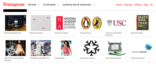
My first impression of Pentagram studies is that it is very simple and doesn’t look very graphic design like. The website is basically a set of images that are linked into their work. The front page is very dull and boring in my opinion. However, when you actually click on one of the links it takes you more in depth into their work and their style of work matches their website which is very simple and gentle. They have created projects such as the type and logo design for Guitar Hero as well as well as other graphic design books such as Colour Works. Their work is mixed with emotion; some of their work is fresh, humorous and vibrant whilst their other work is very simple with the use of two colours.

The website in general makes me a bit sad and confused and doesn’t make me want to continue viewing their website. However, their products on the other hand are alive and full of energy. I believe the studio want to communicate that they shouldn’t be judged by their website but by their work. I would like to know why they have chosen to design their website like this instead of making it more interactive and more vibrant like their work. The website however is very simple and therefore it is easy to use and find the relevant work that you are looking for. If I could change one thing about this studio is to change the way the website has been designed because although it is very simple I think it is too simple and should inform the reader what sort of work they do.


Graphic Thought Facility


This is a London design studio that was founded in 1990 by Royal College of Art graduates. The clients are ranged from London to internationally. I think the website is very vibrant and each category within the website is selected in different colours. It is also very easy to use and very easy to contact. They show their clients work in a slide show so you can have a view of their work. I like how their work is very different and is especially very expressive, simple and has a neat layout. One campaign that caught my eye especially was the Kvadrat campaign which involves shapes and colours. The studio 'explores the physical possibilities of design'. My favourite piece that GTF have made is the museum project in 2003 because they use illustrative print outs on paper and hang it up in the air to create an illusion. I like it because it creates an illusion and plays around with various vibrant colours and makes you think that the 2d piece is actually a 3d piece. 


Friday, 17 April 2015

Attik


When I first went on the website I thought it was very neat and well organised. The website first caught my eye because it was very bold with various images changing every 10 seconds showing off their work. Their work is again very vibrant, unique and original.  The website is very elegant, creative and minimal making me want look through the website. I like how their work is very strong with colours and looks very futuristic. The work is very eye catching, imaginative and sharp. It’s sharp in the way that the colours stand out and almost look 3D. I like how the website has a news feed of their recent activity at the bottom being very informative.  A lot of their work is very expressive and uses warm colours to present this.  The aim of the website is to inform the clients of their work and what work they do. The type is very bold at the top where it shows their variation of work such as advertising, branding, digital and about them. The things that the studio has done successful is that it is all very sharp and almost comes out of the page. This is something that I would like to attempt as it looks very futuristic and looks neat.

Monday, 13 April 2015

Scott's Porage Oats


The packaging has pretty much stayed the same other than modernising the Scotts face to fit todays society. I believe that the advantage of keeping the packaging the same is that it will stay recognised for the image of the Scot. I believe that the imagery and awareness would stay the same because it is doing what its target market is set on.  Another advantage is that there is a promise of satisfaction to remain within the brand therefore changing the branding may change satisfaction of the viewers and they may not like the new view of the product. I believe that the costs would also remain lower because there is a lot of money involved into launching a new company.

Saturday, 11 April 2015

Karmarama Good Works


This campaign is to show how something so unloved can easily change to something unbelievable.  Karmarama’s challenge is to bring back to life and drive growth into something that is constantly shrinking. Karmarama worked with B&Q to show Britains unloved rooms changing. This project was to stop show room in B&Q and to approach a real life room and create a transformation from something we don’t like and looks vile to something more vibrant and beautiful. This was to be reflected in everyday reality across the nation.  This project was to advise people on how to transform a room and to create a commercial impact on the public.

Thursday, 26 March 2015

Mothers to Russia with love


This is a project to act against Russia who are against homosexuals. Russia in 1999 have classified being gay as a mental illness as well as attacks on gay people rising. Therefore Mother London has insisted to help beat this by helping the Russian gay community. They have created Russian dolls featuring five gay icons. These dolls are then auctioned online and the money that is raised will be given to the Russian gay community. Their project is supported by Kaleidoscope Trust who advances the rights of LGBT and listens to people with issues in Russia as well as standing by them. 

Their aim is to stop discrimination against gays. By using Russian dolls they subverted a traditional folk art and changed the meaning behind the dolls by replacing five British gay icons instead. I believe that this is very good and effective because it stops people from being discriminated and shows how people in Britain have become icons even though they are gay.  I believe it shows that Russia’s comment “homosexuality have been classified as a mental illness since 1999 is also wrong because these people clearly have no mental illness just because they are gay and in fact have encouraged people not to be scared for who they are and to come out if they are gay. This project would also suggest that there are people around you who will listen to you and support you if you are gay. I believe that this project is very effective and should continue selling these dolls to exterminate discrimination.

Saturday, 21 March 2015

CE label - Conformity Marking


After seeing a CE label I was interested to what it stood and whether I should remove the label. This is what I found out. 
CE stands for conformity marking for products sold with the European Economic Area. This sign can stil be seen on products outside of the EEA because the product may have been produces inside the EEA and therefore would require to have the CE marking. This makes the CE marking easily recognized outside the EEA hence why people may not be familiar with marking sign. Countries in the EU producing an item must include the CE marketing logo on their product. The purpose of the CE marketing shows certification that the product meets all of the CE marking requirements.