Tuesday, 10 February 2015

OUGD406 - Secret 7 - Studio Brief 1

This is a live brief which is to  Design a 7" record sleeve for the following artists/songs. We had to choose one of the following songs + artists. We were told to try stay away from the obvious choice of album covers and create something unique. I really enjoyed the start of this brief as we had to experiment as a group with different techniques.

The Chemical Brothers - Let Forever Be
Released in 1999 this track features vocals from Noel Gallagher - who also co-wrote it - and has a mesmerising music video directed by the one and only Michel Gondry

The Supremes - Reflections
Our first release from the wonderful world of Motown and the band's first with Diana as the main billing in 1967. This is an extended stereo version of the psychedelic pop single that has never been pressed to vinyl.

The Maccabees - Go
Taken from this London band's critically acclaimed third album Given To The Wild. It will be the fifth and final single taken from it, ahead of the release of a new album in 2015.

Peter Gabriel - Sledgehammer
Apparently this song is all about sex. It's influential stop motion video that accompanied the track's original release in 1986 is an all time great, and we shall be pressing the video edit audio.

The Rolling Stones - Dead Flowers
From arguably the bands' greatest ever record Sticky Fingers. Released in 1971 it is housed in the iconic artwork conceived by Andy Warhol. This will be the first time the track has been released as a 7”.

St. Vincent - Digital Witness
The lead single from her recent album which was crowned album of 2014 by many, including The Guardian, The Sunday Time and NME.

Underworld - Born Slippy
Originally a B-side to Born Slippy, the remix shot to fame in 1996 when it soundtracked the final scene in the movie Trainspotting. We are working with the radio edit of this classic

Friday, 6 February 2015

UPS Logo


1961 Paul Rand designed the UPS logo. In 2003 it was redesigned by Futurebrand. The first logo created by Paul Rand looks unoriginal and concepts of a gift played above the UP. I personally prefer the more modern version of the UPS logo. The first version consists of a shield combined with a gift. The transformation into the second logo began forty-two years later with the removal of the bow tie. The bow tie was removed because it stopped UPS from advancing further than just a package company as well as the advance in technology and how it is all sorted within the system. The second logo came from another rival company merging with UPS to represent a shield which is still used today.

The first logo is more minimal and symmetrical however, it looks quite flat and dim. I think that the use of colour is poor because it isn’t eye catching and looks like it is half complete. However, my preference is with the second logo because it looks 3D and stand out to you. The use of deep and expressive makes you take the logo serious. The logo is also very iconic and easily recognizable whilst being eye catching. The second logo reflects that the business is evolving its strategy.


There are numerous reasons behind changing your brand logo; firstly it may be the same reason that UPS changed their logo and this was to show a change in strategy and performance and to show the advance of delivery to the desired customers experience.  Another reason why UPS changed their logo is because they merged with a rival company and had to represent both companies. A third reason may be that the logo needs to be more modern in the case of Harvard University where the logo looked like it was an oval circle with loads of writing in it. The new improved logo shows the advance of technology and a more modern digital learning environment. The fourth reason could be that your target marker has changed and therefore you need to fit a logo with the new targets.

Thursday, 15 January 2015

Tate Visit


After visiting the Tate I read that the Tate is an ever changing logo. I believe that the ever changing logo is brave however, minimal, creative and futuristic. I believe that it has paid off for the Tate because it is an easily recognisable logo  and has been iconic ever since. The difference that this logo has made is that the logo isn’t like any other; most logos are sharp, flat and very refined whilst this logo is recognised on its blur and change.

“There are a number of variations of the Tate logo, or mark. They range from a standard logo to a blurred version, a faded version and a halftone version. The marks have no fixed size or position and they are not connected with one particular Tate site. The Tate mark helps to build a brand that is fresh and fluid, but has some consistency – one Tate, with constantly changing expressions.”
I believe that the logo matches the Tate because it challenges its recognition and this contrasts the artists inside the gallery as some of the work is very controversial, expressive and irregular. The work inside is very diverse and having the same logo would contrast the work which doesn’t remain the same. I also believe that the Tate is such a well known gallery that it wouldn’t affect the way it is run or the consumer. I also believe that the gallery changes frequently and this therefore compliments the Tate’s logo.

I also believe that changing a logo gives the Tate experimentation with the grow of technology. I also have not seen many blurred logo’s and this therefore makes the Tate more unique as a gallery. Another factor that I noticed is that T, A and E are all very distinctive letters which are very easily recognised therefore, we can easily read the logo and this shows how simple a logo can be make eye catching.

“We designed a range of logos that move in and out of focus, suggesting the dynamic nature of Tate – always changing but always recognisable.”


Wednesday, 7 January 2015

Chanel no.1


I personally really enjoy this product because it was created in 1921 and still looks modern today. I believe that the packaging is classic, eye catching and elegant because it is very pure and less is more. The phrase was adopted by the architect Ludwig Mies van der Rohe as a precept for minimalist design. This packaging remains stylish with a hint of mystery; it holds her name Chanel as well as her favourite scent no5 and the place of origin. Chanel knew exactly what she was doing creating a package that was different to every other one; most packages consisted of complex, colourful and detailed loops and swirls. Chanel created something that distinguished her simplicity and elegance. I believe this package is innovative because nearly one hundred years later it is still effective and still manages to catch your attention.

I believe that keeping the packaging the same over hundreds of years can enhance product recognition and would help keep the brands loyalty intact. Loyal customers are more likely to remain at the brand if the brand is successful in its name and stays with the same name. I also believe if you change your name you lose your brands equity because not everyone will recognize the new design/name. To conclude, limited text encourages viewers to stop and have a look at it, I also believe black text on white has a high impact on the product and makes it easily readable. This text stands out clearly and this makes it easily and quickly readable which is what I believe Chanel wanted to achieve.


Friday, 2 January 2015

Lyles Golden Syrup


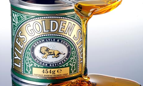
After finding out from Liam in college that Lyles Golden Syrup is a brand that has made few changes over its long history I have decided to write more in depth into it to find the reason why it hasnt been changed. This brand has a very personal look towards it with its history; the lion and bees logo has maintained the same since 1885. This logo was a religious view from Abram Lyle “Out of the strong came forth sweetness”. This has remained unchanged and has become a recognized and iconic figure. The packaging has stayed the same with its use of precise, fluid swirls and this could be seen as an advantage as its eye catching and unique. It is also very iconic and quirky which makes the design innovative and exaggerated.

The product soon became very popular within England was even sold to the royal family in England. This soon led to Lyle’s Golden Syrup containing a “Royal Warrant” on its tin. This was a symbol to show that Lyle’s was an official supplier to the Royal Family. In 2007 Lyle’s was then given a Guinness World Record as the world’s oldest brand. Lyle’s is also seen as an iconic figure in British kitchens. In 2008 Lyle’s Golden Syrup celebrated 125 years in business. Lyle’s Golden Syrup is now selling over a million tins every month and are sent from the UK to places abroad such as Chine, South Africa, Australia, USA and even Yemen.

In conclusion, I believe that the business has worked because they haven’t changed their identity in over a hundred years and has stayed an iconic figure for Britain and their kitchens. Lyle’s Golden Syrup has made few changes to the packaging and I believe that this was the best decision because it remains unique and I like how personal the brand is. It is a very distinctive brand and is easily recognizable and iconic in the UK and other countries. It is now known as the world’s oldest and best loved brand.


Wednesday, 3 December 2014

Iconic Logos and Fedex

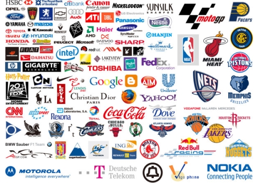
I decided to look at some existing logo designs and why they have become famous for what they are. Here is a big selection of existing logos that have been made recognisable by designers.
This is my favourite logo design because of the secret hidden arrow used within the letters E and X. I like how the words Fed and Ex have come together in two different colours. The colour choice is very vibrant and catches your eye whilst the logo is bold, simple and effective. The typeface is Helvetica and this is a very simple typeface that has been used around for years. I love how the logo uses white space to be recognised whilst using negative space to create an arrow within the two letters. The logo is very easily noticed from a distance and uses two colours that compliment one another. In my opinion the best logo designs are the ones that are simple and will grab your attention immediately. What makes the logo work is that the arrow is hidden from you at first glance but once you see the arrow you cannot miss it again. 


Monday, 1 December 2014

Ad busters


"Blames advertising for playing central role in creating and maintaining consumer culture"

- Juxtape text and images to go against the original campaign/poster
- They are against movies, sports and schools
- Activist networking group
- They would like to go against any industry that pollutes
- moto = "live free or die"
- Their aim is overpower existing posters
- They want to create a change in design

I really enjoy looking at adverts created by ad busters. I think adverts like  alcohol adverts should be juxtaped by Ad busters because they are not good adverts and shouldn't be advertised as loads of children see these adverts and get influenced.
 
They also juxtape adverts such as McDonalds who promote eating there when however, we know that the food there is not healthy and should also be removed. The adverts that Ad busters create are very vicious and are very expressive.